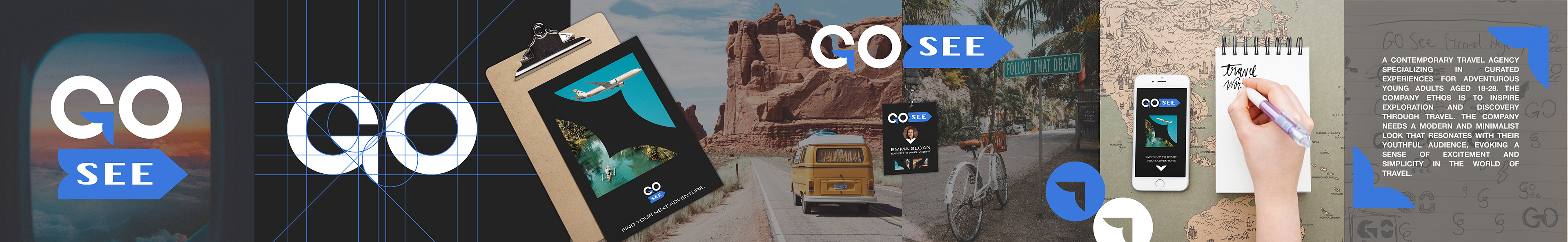

Project
Logo and brand identity concept for Go See, a contemporary travel agency specializing in curated experiences for adventurous young adults.
Overview
The Go See brand was designed with a modern, minimalist aesthetic to appeal to its youthful target audience. The logo and color palette were created with versatility in mind, ensuring seamless application across packaging, marketing materials, social media, and more.
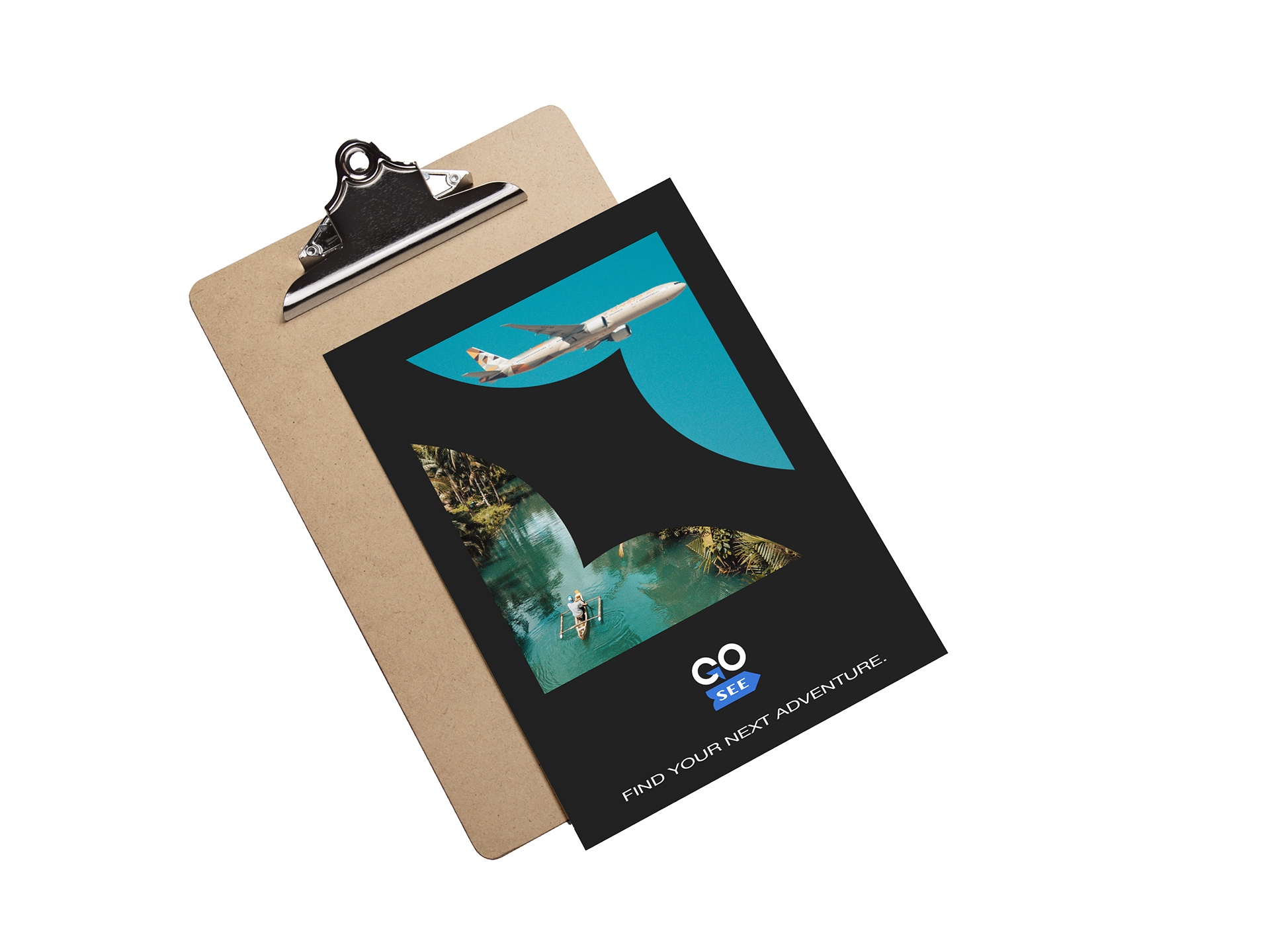
The brand’s identity centers on the concept of exploration, symbolized by arrows incorporated into the logo. These arrows evoke the idea of travel and discovery, and the arrow within the "G" can also be seen as a bird or plane, giving a subtle nod to the freedom and adventure of flying away. The logo is adaptable and can be reduced to a simple icon—the arrow from the "G"—which is consistently applied across marketing materials and packaging, reinforcing the brand’s visual identity. Three variations of the logo were developed to maintain flexibility while preserving a cohesive brand image.

Go See icon logo
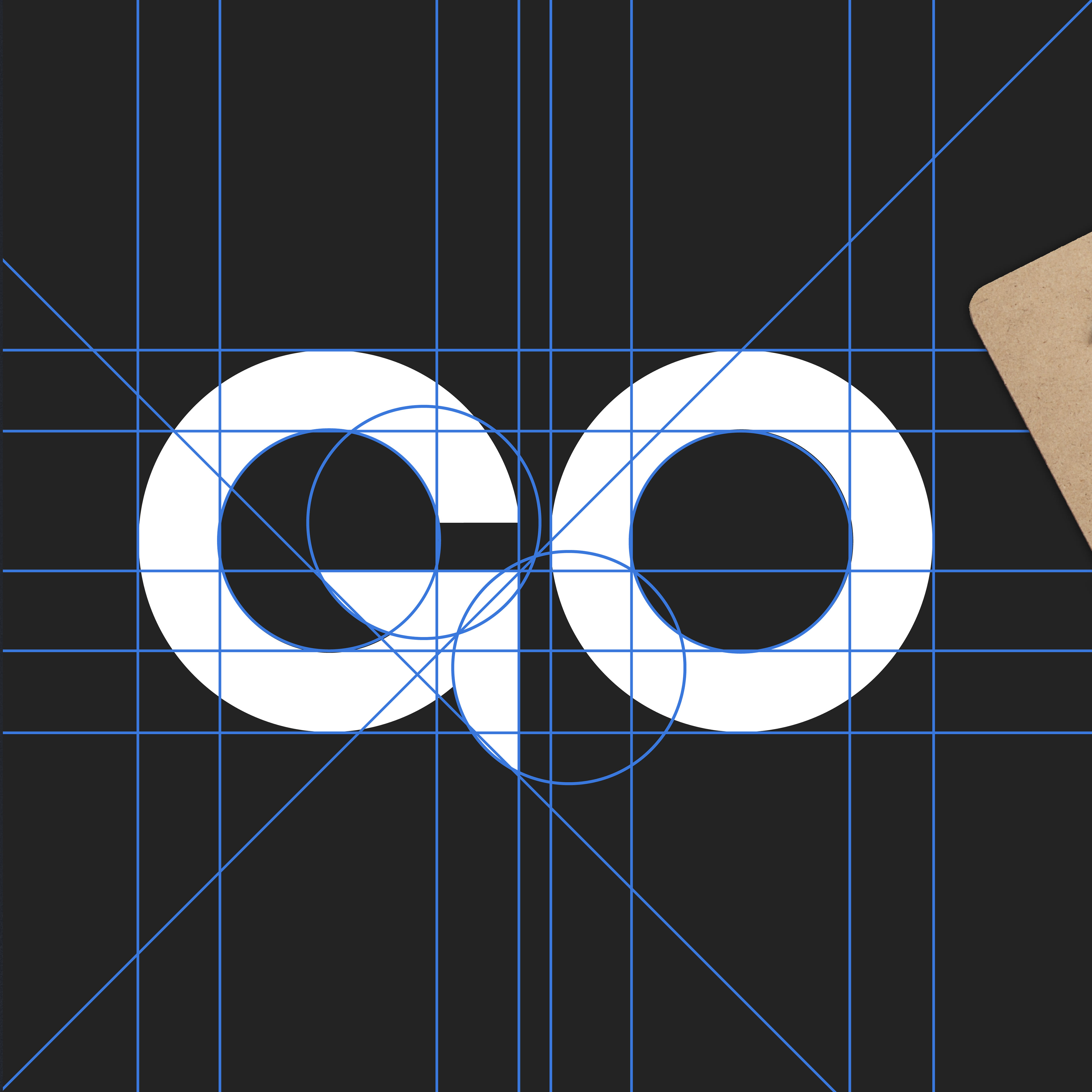
Go See logo grid lines
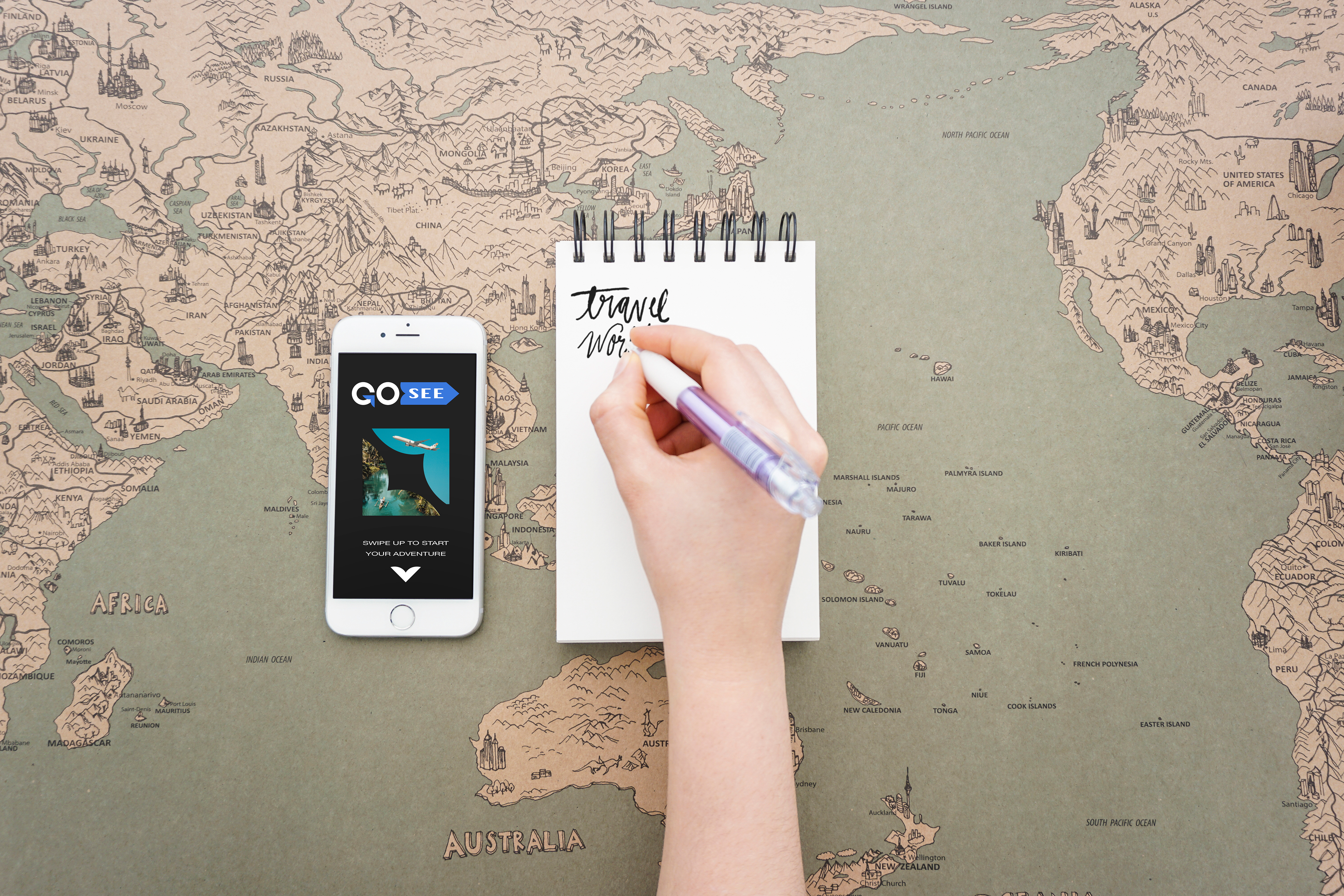
Go See app mockup
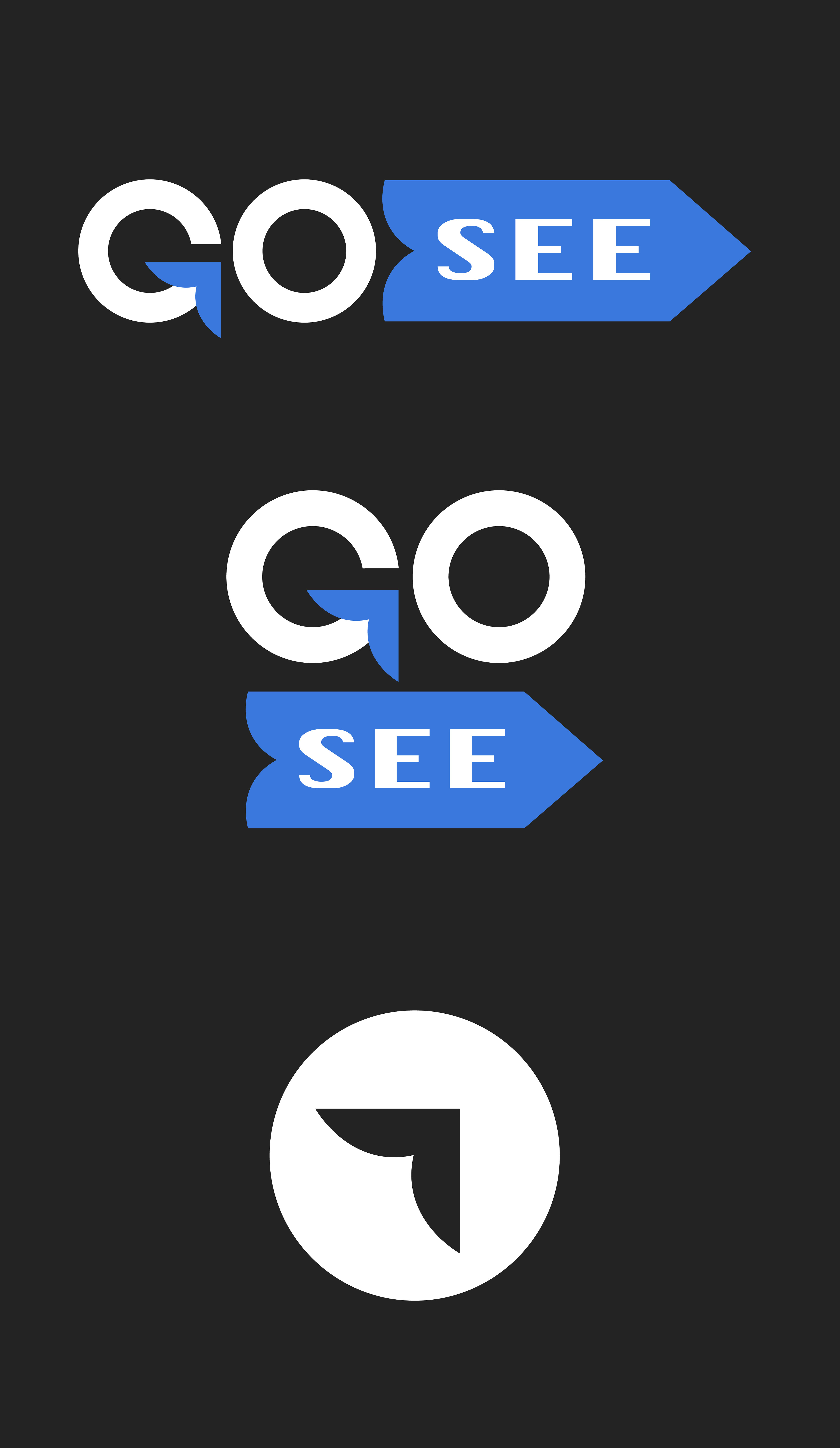
Go See logo variations
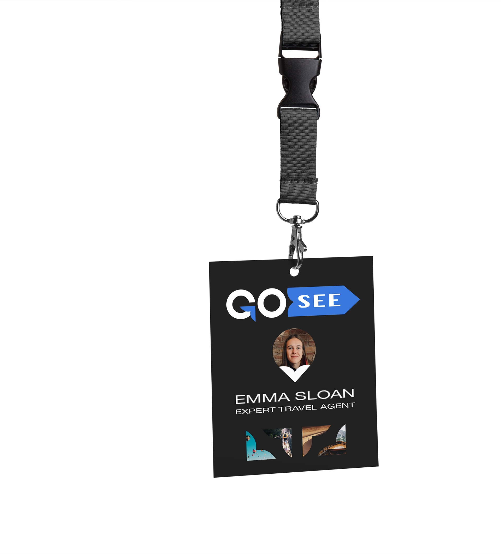
Go See employee tag mockup
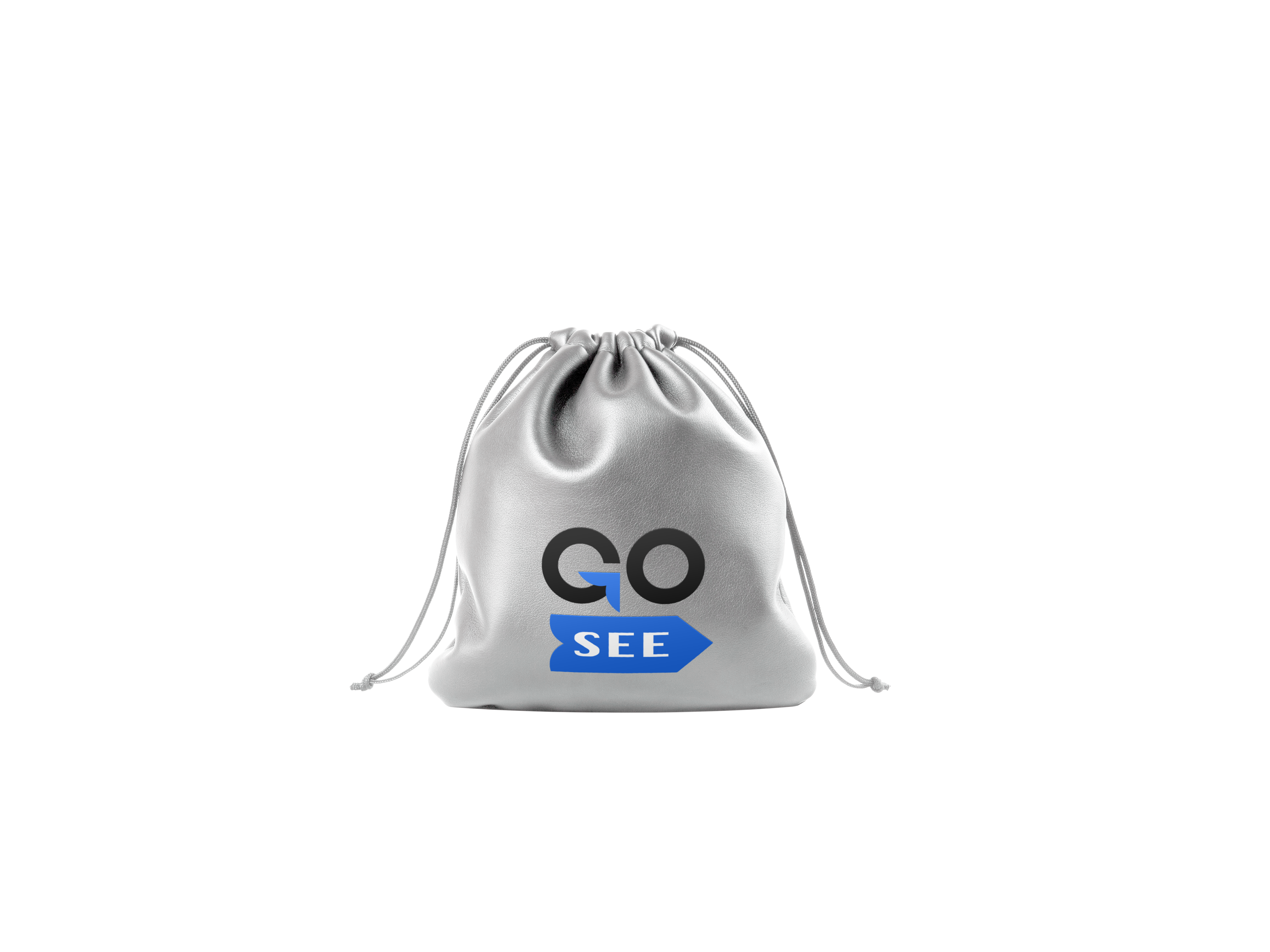
Go See bag mockup
Go See travel itinerary package mockup